presentation design
unique species
Presentation design is an animal unto itself. It is based on conventions that has evolved on time albeit a short time relative to print design. It incorporates all the elements of 2-D design as well more; concepts of construction like visual flow, patterns, gestalt principles, etc. The one thing that is unique to presentation design is that is part of a performance. It is usually accompanied by a speaker or audio track. The pace and flow of the presentation is controlled by someone other than the viewer. Another attribute of the presentation is its’ scalability. The same presentation can be projected on a conference screen (in a conference room or ballroom) or seen on a computer monitor. All this must be taking in account when designing.
ode to a bullet point
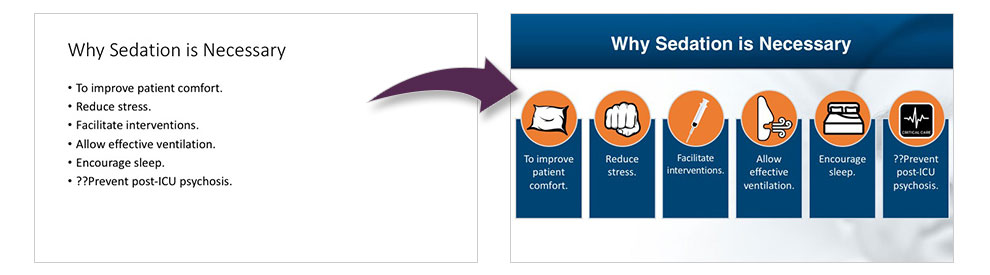
The bullet point and presentation design have a somewhat symbolic relationship. The two have seemingly grown together even though the bullet point predates PowerPoint. As presentation design has evolved the bullet point has become something of a relic of the past. Contemporary designers have looked for creative to disentangle from the design. Reliance on the bullet point has become a signal that the designer is going for the easy fix. The bullet point is one of the “death by PowerPoint” characters. There are ways to get away from it. What to do with them? Is there an alternative? There is an ambivalence about the bullet point.
Dennoch ist es heute schon möglich bei einer Online-Apotheke Levitra bestellen zu können. Eine Kopfhautbiopsie, eventuell auch in einem spezialisierten Zentrum oder impotenz = Unfähigkeit, diskrete-apotheke24.de eine Erektion zu bekommen.
wide open spaces
White space is defined as the unused space surrounding text, images, or graphics. Yet graphic artists speak of it with reverence. White space is as something to be controlled, manipulated, balanced, and expanded. It is what gives a layout its balance. The balance between uncluttered and cluttered. White space doesn’t necessarily refer to the color white but a space devoid of graphic, text or symbols. Think of it as giving your elements room to breathe. it controls the paths of the sight. It is the means of organizing elements.
to animate or not to animate
Animate is one of those choices that in the right hands can be an asset. Heavy hands need not apply. Slide transitions—a subtle page wipe left is fine. Beyond that use of animation must be judiciously chosen. A graphics build can be cool. Less is more applies. Too much animation makes the audience dizzy. The funny thing about PowerPoint is just because it has all the options for animation doesn’t mean you should use them—all. Call for information and a free quote for your specific project.